The Engagement Dashboard contains visualizations that provide insight into how learners are engaging with their courses. The goal of this dashboard is to help users, primarily instructors and advisers, to identify at-risk learners so that they can intervene and get learners back on track. The information provided in the dashboard allows for individualized improvement suggestions by providing context and a holistic view of the learner. By filtering out irrelevant data and combining metrics by filtering on cards, users can focus on their own definition of an at-risk learner.
Viewing and Interacting with the Engagement Dashboard
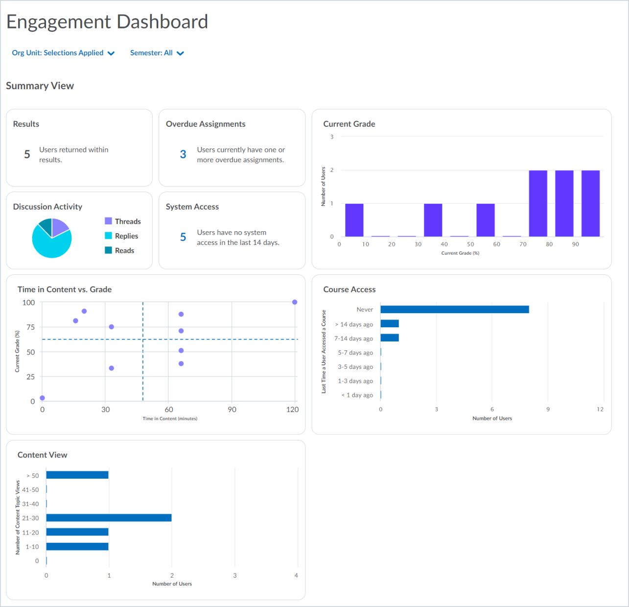
The dashboard contains 3 main sections:
- Filters, which appear as drop-down menus for Org Unit and Semester. If you click a data point in a chart in the Summary View to further filter report content, those filters are also listed in this area.
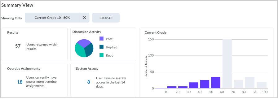
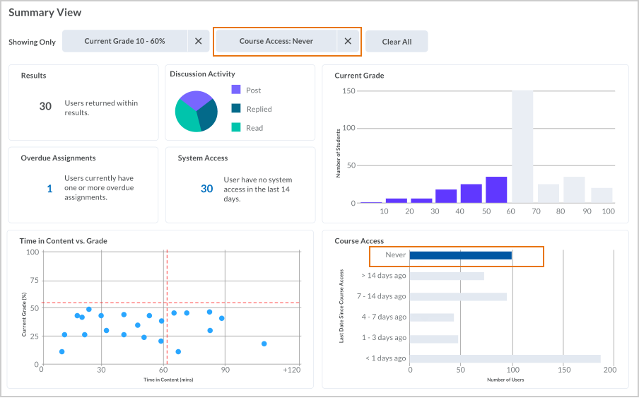
- The Summary View includes the Results summary, Discussion Activity pie chart, Overdue Assignments summary, System Access summary, Current Grade bar chart, Time in Content vs. Grade scatterplot, Course Access bar chart, and Content View bar chart.
- The Results area that contains a dynamic user table of learners who meet the criteria applied to the dashboard. As you add filters to the summary data, the learners listed in the User Table automatically change to reflect the updated Summary view.
A pop-up appears when you first access the Engagement Dashboard that summarizes what displays in the default view. The Org Unit drop-down filter includes a list of all courses in which a user is enrolled as Course Administrator and includes a search bar to locate the desired course. However, that search is limited by the semesters selected in the adjacent "Semester" drop-down menu. The Semester drop-down menu defaults to three future semesters and will need to be manually changed by the user before they can effectively use the search function.
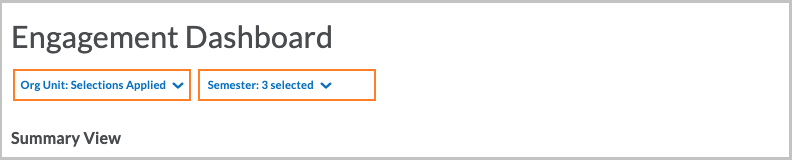
You can dynamically add or remove courses by clicking the check box beside the org unit name. You can also limit the dashboard query results to specific semesters (sorted by date) or roles within your organization.
If the auditor permission path is enabled, auditors (users with an existing auditor relationship) will see only user-level data about the learners they audit.
When you interact with cards or filters, any filters you apply are saved to the URL. You can bookmark views in your browser and return to the same view in the future. If you share the URL with another user, note that their permissions may differ and cause them to see different results with the same link.
Using the Summary View
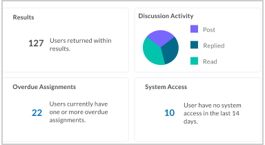
The Results block indicates the number of learners represented by the charts in the dashboard. This is the number of learners that appears in the user table in the Results section at the bottom of the dashboard.
The Discussion Activity pie chart indicates the number of discussions created, replied to, and read. If you hover over a pie segment, a pop-up appears with a number and description of the segment. This is helpful for understanding the proportion of passive and active social engagement. If you click a segment, the rest of the Engagement dashboard automatically filters the returned data for the learners represented by the segment. This is also summarized in the results table.
The Overdue Assignments card displays the number of learners meeting the filters applied to the dashboard who have one or more overdue assignments. If you apply filters to the dashboard content, this number automatically changes to reflect the learners reflected by the updated data.
Note: Group assignments are not included in the Overdue Assignments metrics.
The System Access card indicates the number of learners who have not accessed the system in the previous 14 days. Access is counted whether the learner is using the Brightspace Pulse app or Brightspace Learning Environment in a browser. This is also summarized in the results table.
Using the Current Grade bar chart
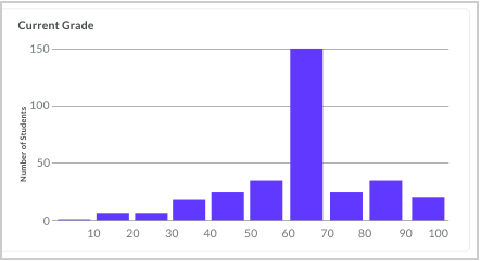
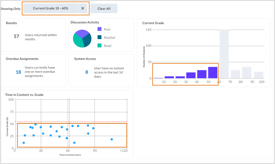
If you click one or more bars, the dashboard filters the returned data for learners and courses where the learner has a grade in the selected range. For example, the following image shows the dashboard filtered to include only learners who have less than 60% in a course:
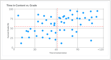
Using the Time in Content vs. Grade scatterplot
If you click a quadrant, the dashboard filters on the learners and their courses in that quadrant.
- Data points in the top left quadrant plot learners who have an above-average grade and spend below-average time in the content.
- Data points in the top right quadrant plot learners who have an above-average grade and spend above-average time in the content.
- Data points in the lower left quadrant plot learners who have a below-average grade and spend below-average time in the content.
- Data points in the lower right quadrant plot learners who have a below-average grade and spend above-average time in the content.
To view the details for the quadrant, hover over the quadrant:
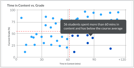
When you apply filters to the report, the scatterplot also changes to reflect the new query results. For example, if you apply the filter for learners who have less than 60% in a course that we used earlier, the scatterplot also dynamically changes to represent that filter.
Using the Course Access chart
The Course Access bar chart indicates the number of days since learners last accessed the course.
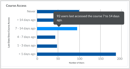
If you click one or more bars, the dashboard filters the returned data for the learners and courses where the learner has accessed a course in that time range.
Note: Depending on the filters you applied, a learner could be counted in more than one date range, and/or more than once in a single date range if they are enrolled in multiple courses.
You can use more than one filter on the Engagement Dashboard to display more precise, relevant information. For example, if you apply the filter for learners who have less than 60% in the course that you previously used, you might also apply a filter on the Course Access bar graph to further refine the dashboard results to learners who have never accessed the course:
Using the Content View chart
The Content View bar chart aggregates the number of times learners looked at course content.
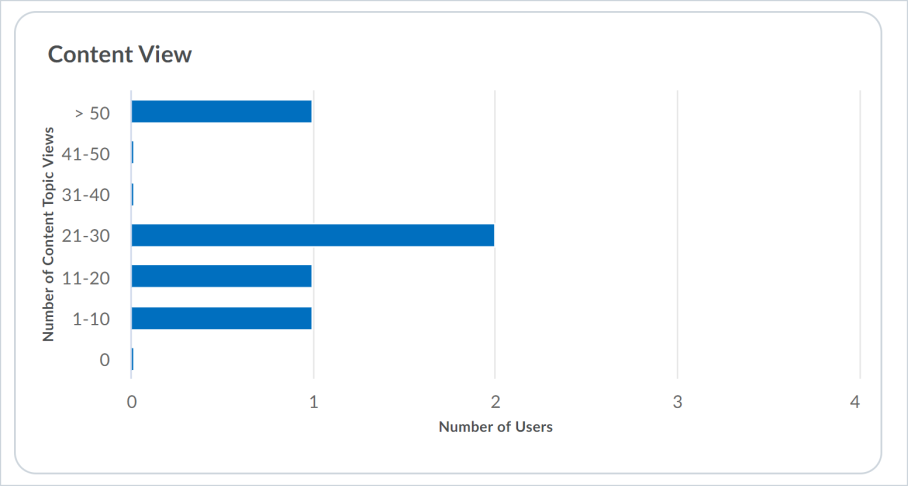
It allows you to review how many times items in the course content tool, such as images, PDFs, or Word files, have been viewed to better understand content viewed offline or that was downloaded.
If you click one or more bars, the dashboard filters the returned data for the learners and courses where the learner visited a course the specified number of times.
Using the table in the Results section
The default view of the user list table contains all the users reflected in the dashboard query results. When you change the courses displayed on the dashboard or apply filters, the users that appear in the table also change to display those reflected in the new query results.
For each user, the following information is included in the table:
- First and last name, username and UserID
- Number of the user’s courses reflected in the query results
- Average grade across the user's courses reflected in the query results
- Average time in the content for the courses reflected in the query results
- Average discussion activity for threads created, threads read, and replies for the courses reflected in the query results.
- The last time the learner accessed the system.
Note: If there is a predicted grade for the learner, it appears for all users who can see the dashboard.
At the bottom of the list, there is a total number of users:

You can click a user in the results table to see their Learner Engagement Dashboard, and learn more about engagement across their courses without aggregating the data from other learners. Any filters you apply to the Engagement Dashboard will persist when you navigate to the Learner Engagement Dashboard.
Additional information can be found within D2L Brightspace documentation: Using the Engagement Dashboard